Optimizing UX Forms for Accessibility and Inclusivity
Practical tips for designing simple and inclusive forms for mobile design
Forms are a key component of user interactions. Whether it’s a sign-up, contact, or checkout form, intuitive and accessible forms are crucial for the success of a design. A well-designed form can boost conversions, reduce user frustration, and enhance the overall satisfaction.
However, while recently improving a form experience for a project at work, I came to the realization that I did not know what separated a good form from a bad one. Specifically, I was unsure how to create a form that was not only following general best practices, but was also accessible to a diverse range of users with varying disabilities and modes of navigation.
After reviewing various resources focusing on aspects from user experience (UX) writing to impacts of cultural upbringing on interpretation of design, I compiled and implemented best practices that I found to be the most inclusive and impactful for my design and needs. While going through this process, I kept in mind that best practices transform throughout time and exceptions always exist, especially when working with highly contextual components like forms.
While I will touch on other aspects of form creation that are important, I want to highlight the key modification made to transform this screen and delve into the reasonings behind each decision.
There are 3 main components to a form:
- Structure - the arrangement of the form and grouping of fields
- UX Copy and Writing - writing for elements such as field labels, buttons, or placeholder texts
- Feedback and Validation - Feedback letting users know whether or not submissions are successful.
Structure
Constraints
When determining the hierarchy of the form, there are a few constraints to keep in mind.
-
Technical needs: Some data may need to be collected before other bits of data. This is especially important if new fields may be displayed based on former pieces of information.
-
User Needs: Create logical groups will help people to understand the form. Using Gestalt principles, such as similarity or proximity, will help the user understand what options are grouped together, allowing for a simple and quick completion.
-
Business needs: Depending on current performance of the form or business goals, there may need to be emphasis on specific components on the form. See the image below for an example of this.
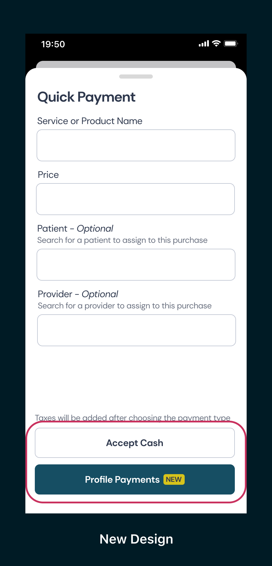
Although accept cash is currently the most used, or primary, button for the user, the company has recently invested in and is implementing a new method of accepting payments. "Profile Payments" is highlighted to draw attention to the new feature that is available to apply for.
Order the Form Logically
When arranging the sequence of form fields, organizing them in a logical and thematic manner will help users have more clarity. In addition, creating logical groups can help people focus on one group at a time rather than being overwhelmed with too many requests. For example, when collecting contact information such as email, telephone, and address, it is preferable to group these together rather than scattering them throughout the form. Adding appropriate padding and spacing helps users identify boundaries for each group and reduces the cognitive load.
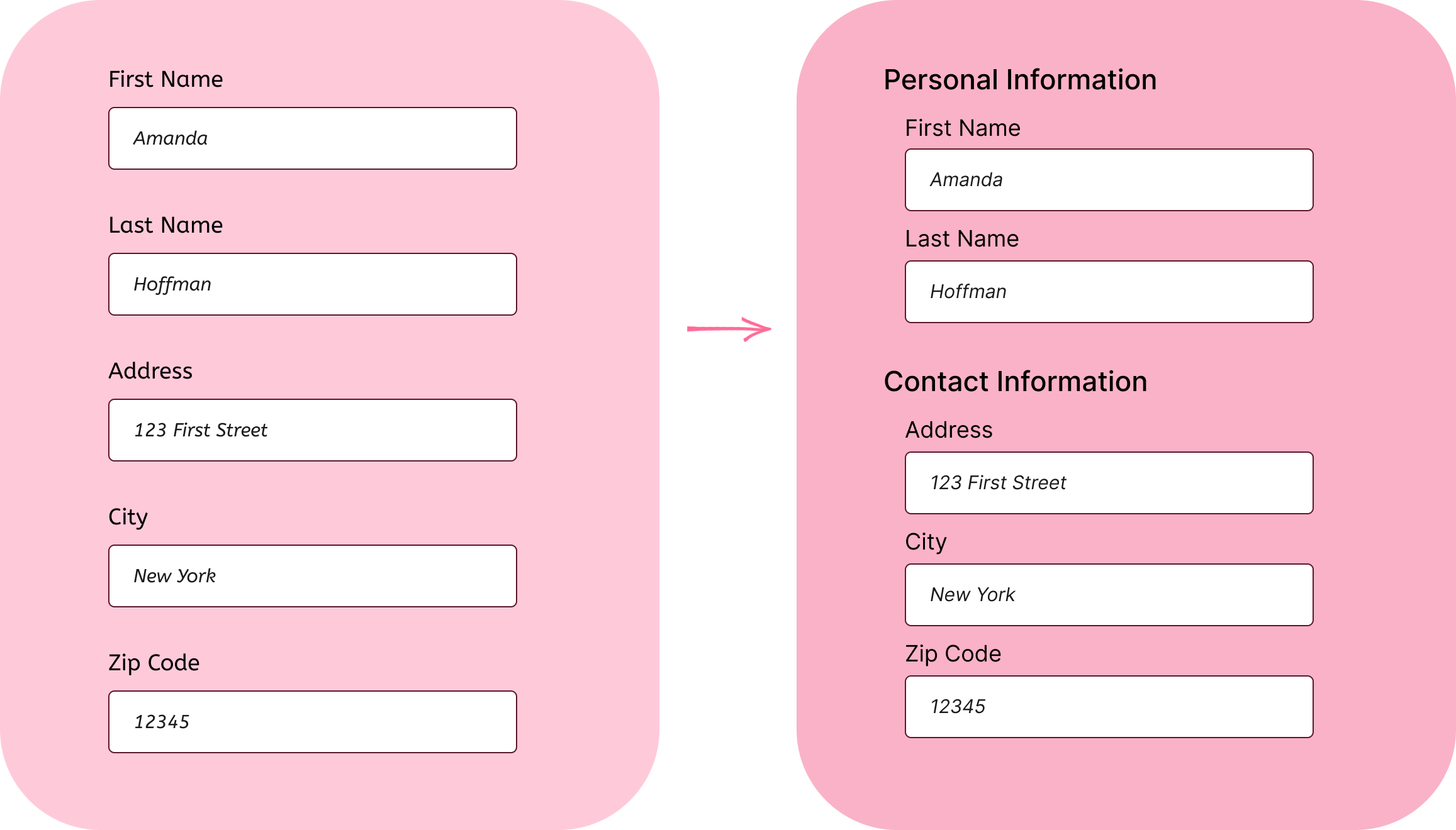
Simple spacing may be used between groups or section headings or labels as seen above.
UX Writing
Crafting a well-balanced tone and delivering explicit and concise labels and instructions can greatly enhance the user's confidence, not just in the specific form, but also in your broader brand image.
In general, we should aim for short, concise, and accurate word choices to provide clarity to the user.
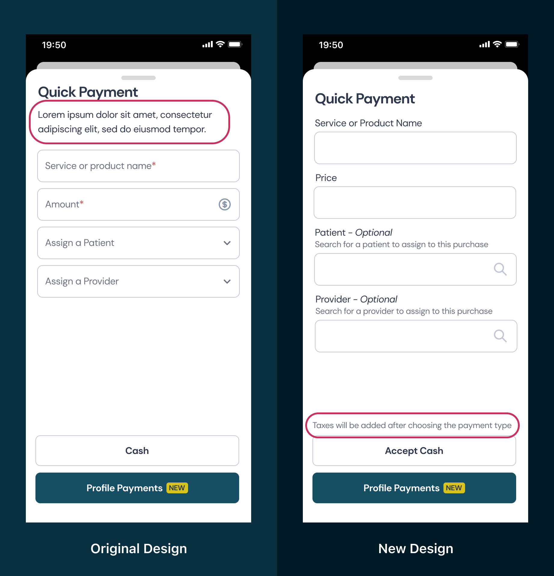
In the original design, lorem ipsum was added as a placeholder without an established plan for what would be typed here. Text should only be added when it will help the user experience. I added some information about taxes to ensure the user is not confused with the price that should be entered.
Labels
Effective labels for each field in the form significantly improve the user experience by providing intuitive guidance, reducing cognitive load, and streamlinging the process of inputting accurate and relevant information.
Top-Aligned Labels
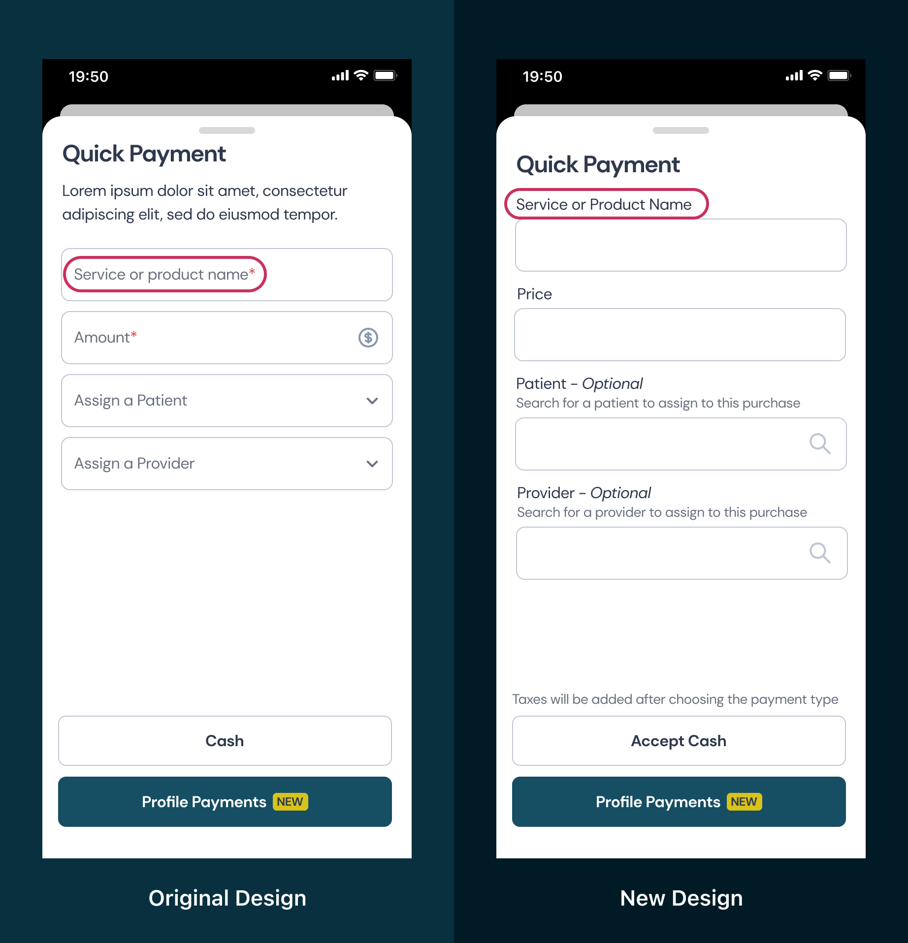
In general, labels should be top-aligned to help users quickly scan through the page. For accessibility and ease of use for all users, the label should not be inside of the input field and should meet the WCAG AAA standard for color contrast. This would help a variety of users. For example, those using a screen reader will be able to access the information audibly and individuals with motor impairments can navigate and engage with the interface more conveniently due to the increased size of the clickable area.
Concise and Specific Word choices
Labels should utilize clear, user-friendly language that is precise, avoiding jargon or technical terms that may cause confusion. Labels should accurately reflect the information or action required in each field.
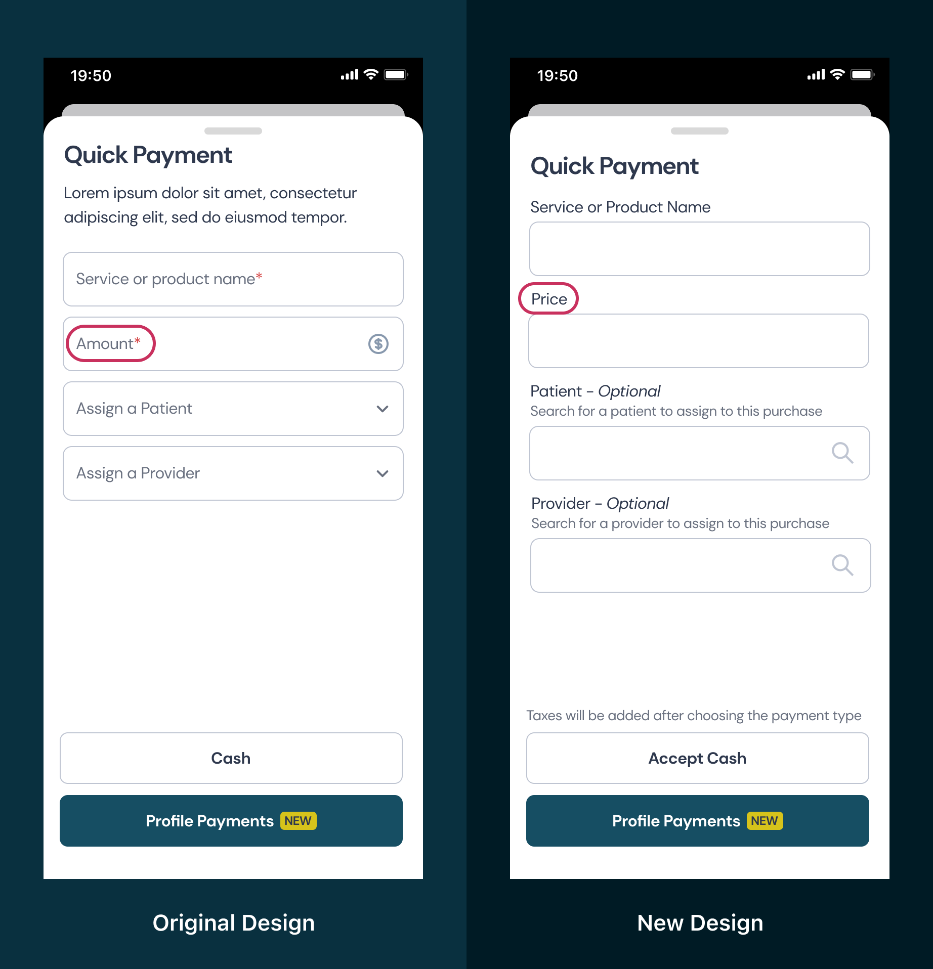
In the original design, "amount" was the current label for users to insert the price of the item. However, this could be interpreted as how many items are being bought rather than the price. In my updated design, I replaced the label with "price" to be more concise.
Avoid Upper Case Lettering
Uppercase text is slower and usually more difficult to read. When attempting to quickly scan through available options, people notice the shapes of the words rather than each letter. However, when using all caps, the height of every letter becomes identical, forcing us to focus on each letter individually to read the word. Uppercase text can be used sparingly to reduce focus on the text. However, it should not be used for contents of the form such as labels, placeholder texts, or helper texts.

Don't Hide Helper Text
Helper text is the extra instructions that may be included past the label. This can be used to give the user extra information, such as why the data is being collected from them or what type of payment is accepted. If this text is being utilized, it should be displayed rather than hidden behind an exclamation or question mark icon.
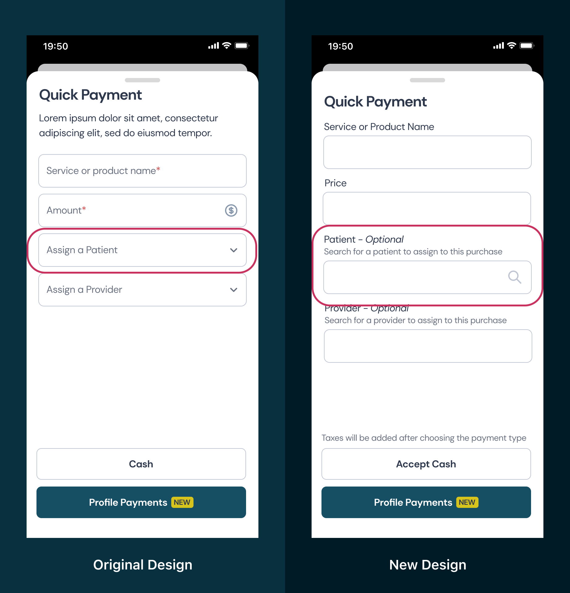
Placeholder Text
Placeholder text is there to provide users with extra guidance when filling out a field. However, there are a few common practices that are problematic for many users.
- Placeholder texts are often grayed out, causing low contrast. This results in text that is difficult to read and not accessible to many users.
- Auto-translation features of browsers will often skip over placeholder texts. This means that if a person requests for a page to be translated, the placeholder content won't be translated and will remain as the originally authored language.
- Screen readers often skip placeholder text and won't read it aloud. This causes difficulties for visually impaired users or others who benefit from auditory information.
- When a user starts to type, **the placeholder text disappears. This means that the user might not remember what the instructions were or cannot check that they have entered data in the correct field.
One common solution for placeholder text is to transition to a floating label once the user begins typing. While this allows for space saving, this does not solve the other various usability issues. This information still may not be translated or read aloud by screen readers and is typically a small text size. This type of label also takes away the opportunity to provide help text and a label. Rather than using placeholder text to provide additional information, help text can be positioned above the input field.

When clicked on or filled, the title becomes very small and difficult to read. With the title on top of the field, the information inside of the field as well as the title remain accessible and inclusive.

Moving the labe to the top and adding help text below the label allows for greater accessibility and for users to have access to the instructions while filling out the field.
Optional Vs. Required Denotation
When using optional fields, make sure that it is clear which fields are optional. While using asterisks is a common denotation used to mark required fields, it may not be clear what this means to all users. Also, if your form is concise and only asking for the important information, there will likely be more fields that are required than optional. Because of this, marking those that are optional rather than required may help provide a visual cue that it is different for the user.
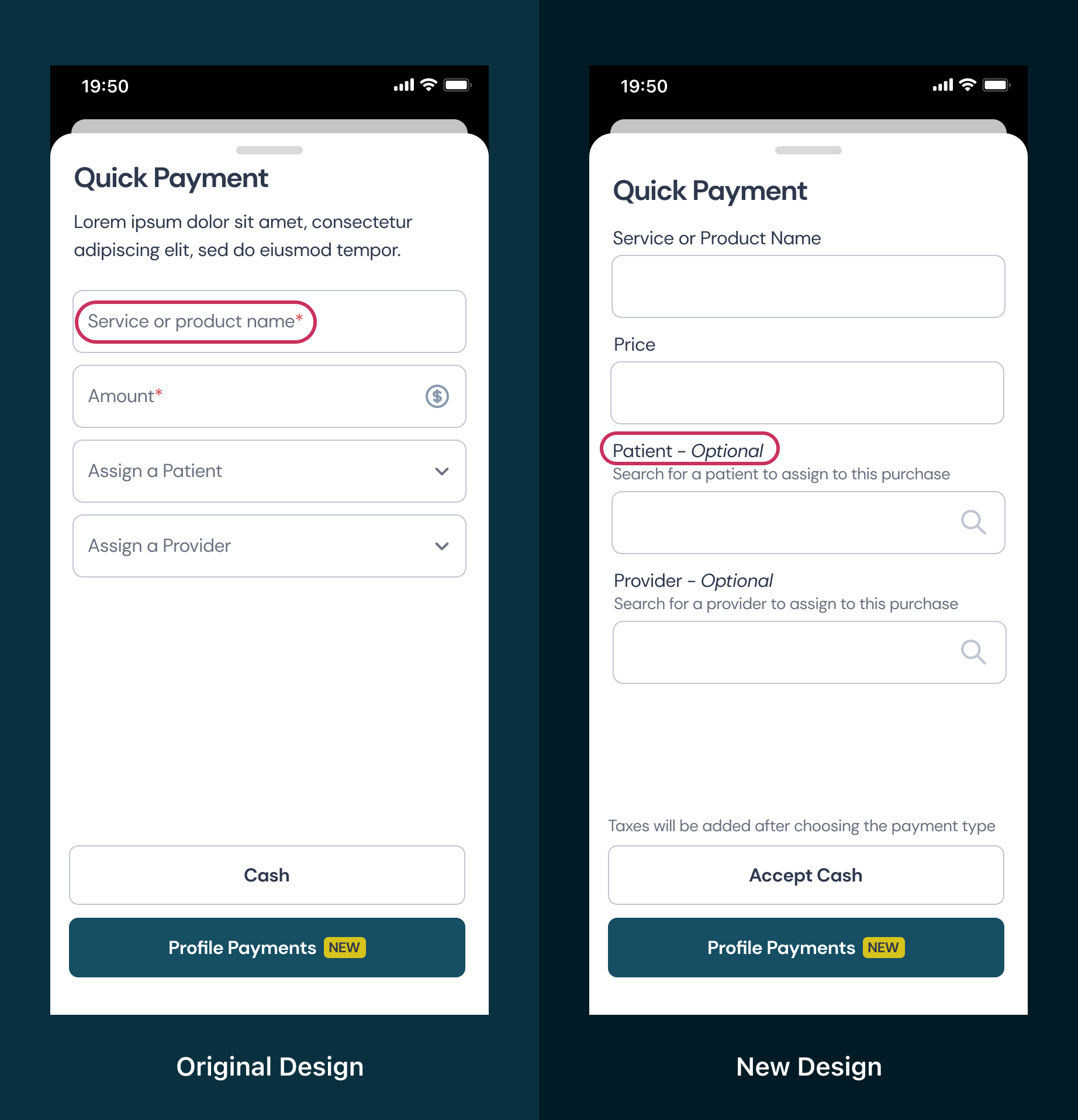
Rather than using an asterisk to mark required fields, I added the word "optional" after the fields that do not need to be filled out by the user.
Action-Based Buttons
When providing a button in a form, it is important to describe the action that will be completed by clicking the button. There are situations that "submit" or "cancel" may be effective choices. However, short and action-based phrases can help with overall user flow and understanding.
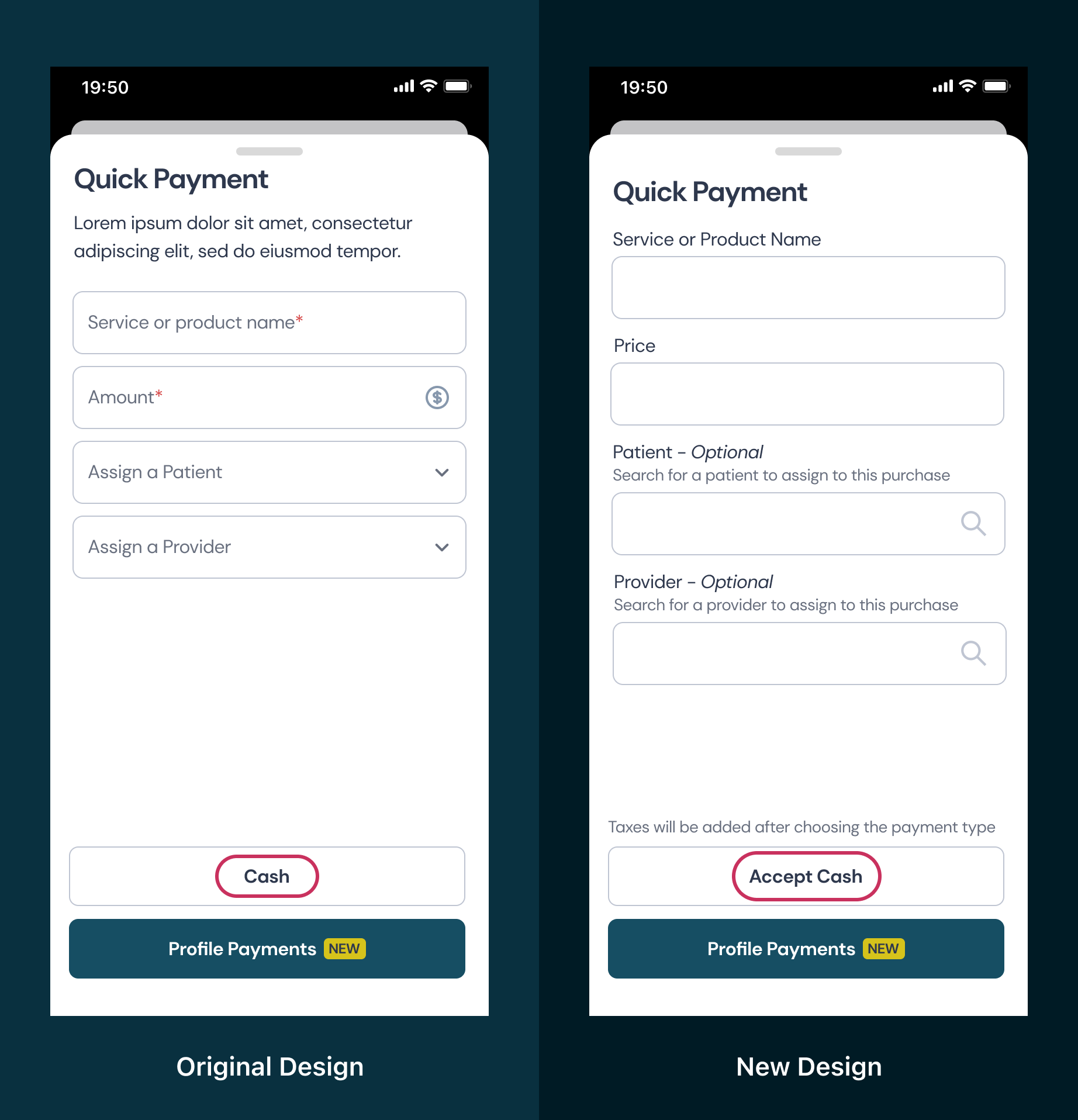
For my updated design, I changed the button writing to "accept cash". When writing button text, use the phrase, "I want to..." to lead into what the button will say. This helps ensure grammar is correct as well as making sense for the user as to what will happen next.
Another consideration is including first-person voice on the buttons. This depends on brand style and overall tone, but has been shown to have higher conversion rates. Using words such as "create my account" rather than "create account" can help increase user connection.
Creating a distinction between primary and secondary buttons is also essential for user satisfaction. A clear visual distinction between primary and secondary buttons allows us to direct users towards the most expected action.
Accurate and Consistent Use of Icons
If a field is a drop down menu, search bar, or other interactive element, it may be helpful to add an icon. However, the icon will only be helpful to the user if it is accurate. If other icons are used throughout the design, it is important that there is consistency in what each icon means.
![]()
In the original design, an arrow was located at the end of the bar. This typically indicates a drop down menu with options. However, this field acts more as a search bar and allows the user to search for a patient name rather than choose from a list. To help the user understand what will happen when they activate this field, I switched the arrow icon for a magnifying glass icon.
Feedback and Validation
There may be fields throughout the form that can be incorrectly filled out by the user. It is important to think about, and communicate with developers, what and when feedback should be given.
Confirmation Messages
Confirmation messages allow the user to know when data being entered is correct or needs to be adjusted. This can include formatting or length requirements.
Inline Validation
When validation is required for users' data entry, it is better to validate as the user moves through the form rather than when they attempt to submit. One reason this is less discouraging to users is that they are already thinking about that information. It is easier to update or fix the data entry when they are already focused on that piece of information. Also, if the validation is presented only when the user presses "submit" they are more likely to feel that it is disrupting progress and will give up.

Helpful Error Messages
Ensure that error messages tell what needs to be fixed by the user. A simple error message such as "non-valid password" does not tell the user what needs to be fixed. Instead, a message that includes what parameters of the password requirements were not met would be more helpful. For example, "password must be at least 8 characters long".
Usability Testing
When finalizing the form design it is important to complete user testing, optimize for various screen sizes, and complete other validation measures. It is important to validate the existence of each field within the form and verify that users are able to complete the intended tasks successfully. Testing throughout the process, from early designs to after implementation, can help to ensure goals are met and improvements are made.

Summary
Throughout the process of optimizing my form design for accessibility and inclusivity, I learned about the small but intentional modifications that can greatly enhance the user experience. It is crucial to think about what users will be experiencing while they use the application and consider diverse needs and abilities.
Continuous improvement is key in the field of design, and it's important to recognize that there are always opportunities to enhance our designs further. While our own experiences and assumptions may provide valuable insights, true knowledge and understanding come from research and direct user feedback. By continuously seeking feedback, conducting user testing, and staying open to iterative improvements, we can create more inclusive and user-friendly designs that truly meet the needs of our users.
Furthermore, seamless handoff to developers is crucial to ensure that accessibility and inclusivity concerns are not lost in the implementation process. Collaborating closely with developers and providing clear documentation and guidelines can help bridge the gap between design and development, resulting in a final product that upholds accessibility standards and delivers a positive user experience for all.